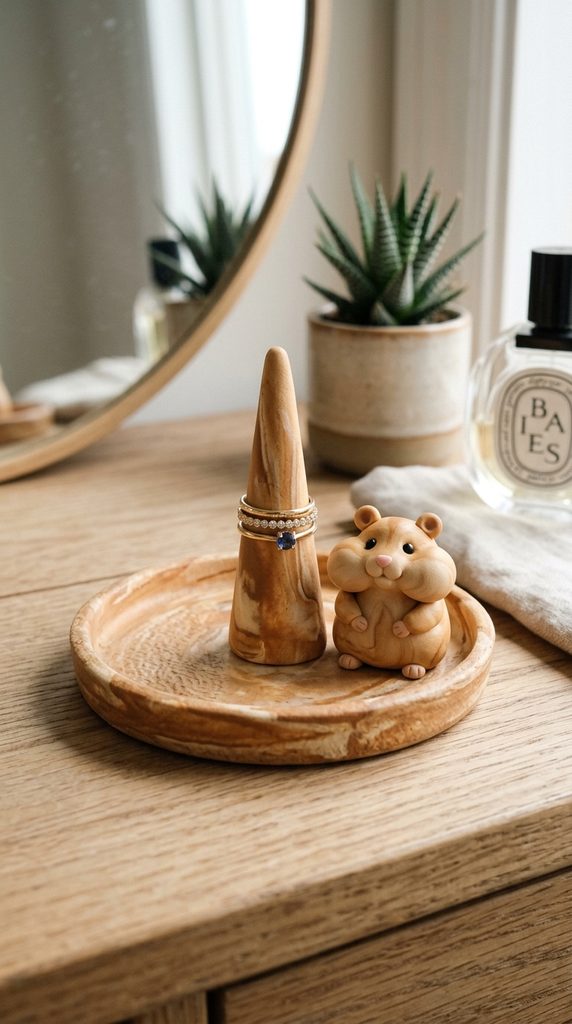
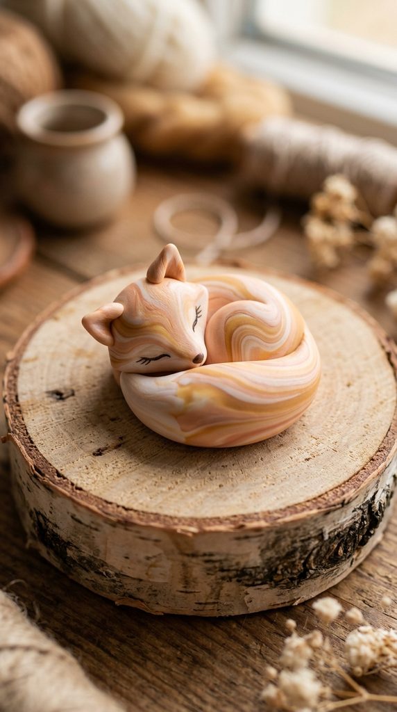
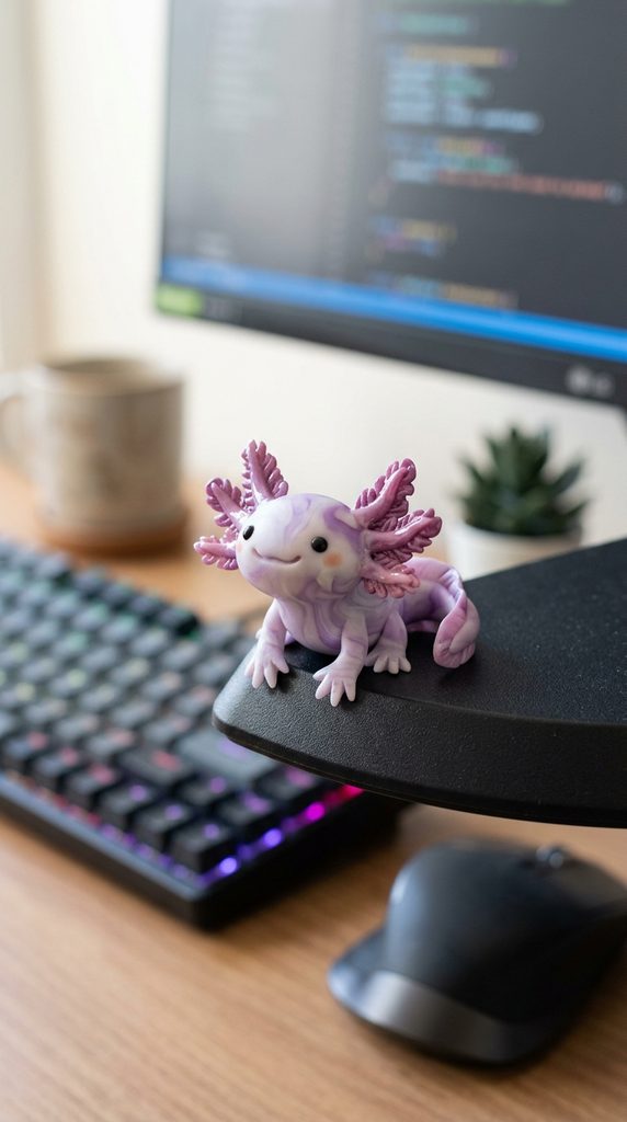
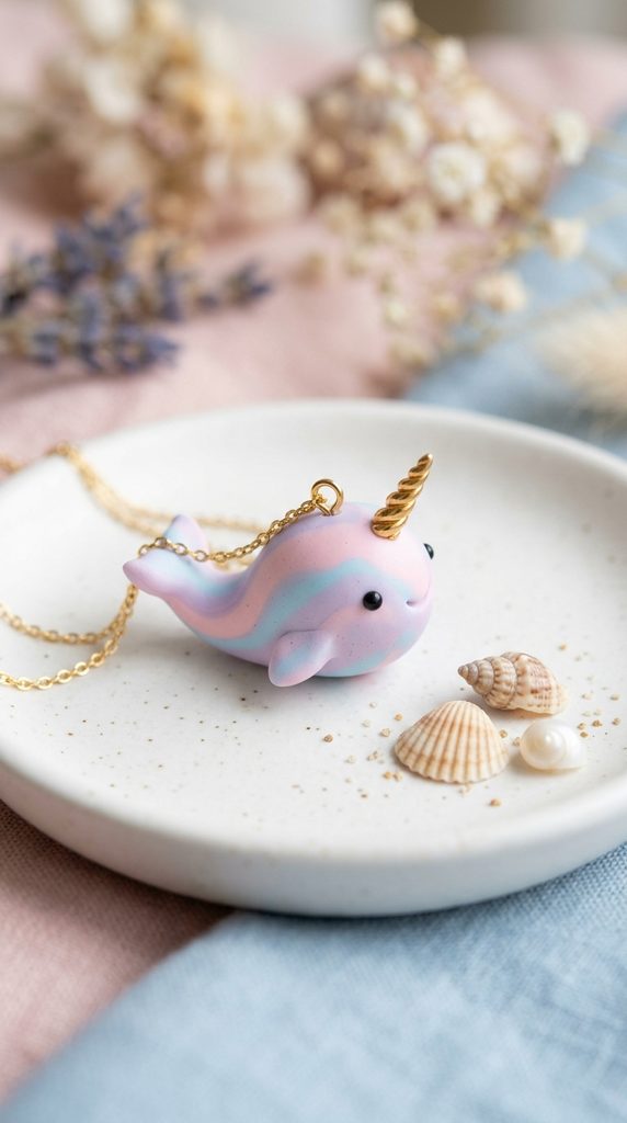
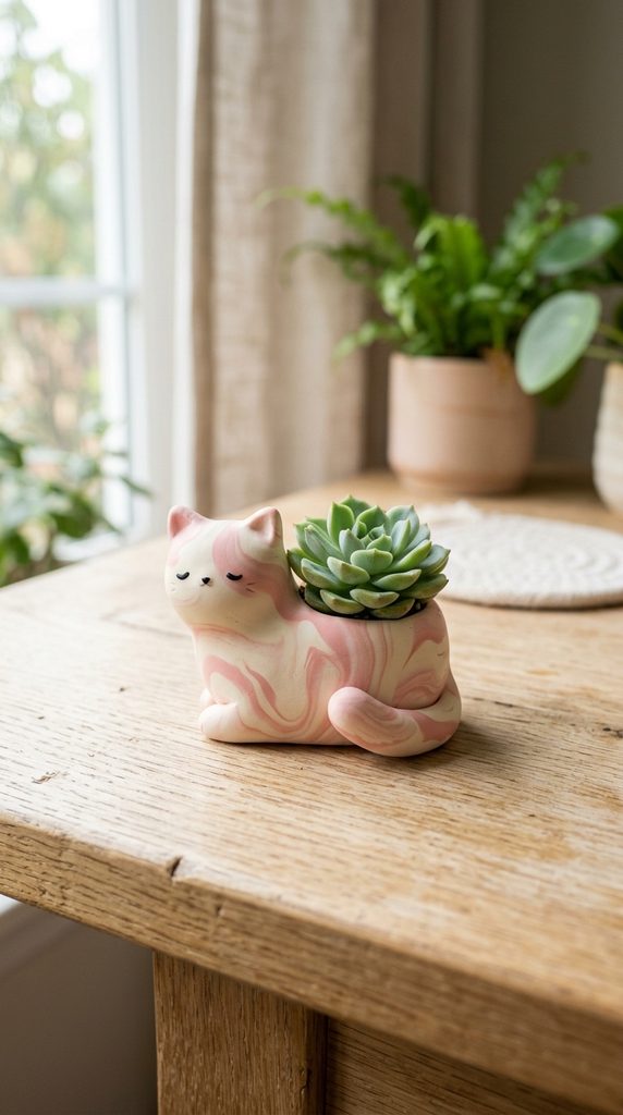
Pastel color palettes form the foundational aesthetic of the kawaii crafting movement, where miniature figures, dessert charms, and decorative figurines celebrate gentle visual softness. When exploring creative inspiration across online craft communities, makers frequently seek balanced color recipes that convey sweetness without appearing washed out or chalky. This extensive guide provides practical color theory formulas, mixing ratios, and pigment distribution methods to craft ten distinct pastel kawaii clay palettes from scratch. Readers will learn the precise mechanics of blending saturated base clays with titanium white and translucent mediums to create smooth, non-streaky tints. Working with polymer clay in lighter values presents unique physical challenges, including heightened visibility of atmospheric dust, uneven baking discoloration, and pigment shifts under heat. Understanding how to manage light reflection, clay opacity, and surface undertones empowers artists to construct cohesive collections of miniature characters, cabochons, and small home accessories. Each color scheme examined throughout this tutorial includes actionable blending steps, specific part-to-part ratios, and targeted sculpting applications suitable for delicate designs. By following these reliable mixing formulas, you can establish an authentic, professional color workflow that elevates the visual quality of your handmade craft collections.
Why Pastel Kawaii Palettes Remain an Enduring Craft Trend
The sustained popularity of pastel kawaii aesthetics across modern design platforms reflects a broader cultural appreciation for nostalgic, comforting, and visually gentle home accents. Characterized by rounded silhouettes, emotive faces, and dessert-inspired palettes, the kawaii genre transforms ordinary miniature sculptures into uplifting artistic statements. From an interior styling perspective, muted pastel tones integrate smoothly into contemporary living spaces, matching neutral nursery themes, desktop organizers, and minimalist gallery arrangements without visual clash. For beginning sculptors, mastering pastel clay formulations offers immediate practical value because lighter tones soften tiny structural imperfections that stark black or hyper-saturated primary colors often accentuate. Furthermore, blending custom pastel shades provides exceptional economy, allowing makers to maintain a lean inventory of pure primary pigments alongside large blocks of neutral white. This low startup requirement fuels widespread DIY appeal, enabling crafters to experiment with complex visual gradients, marbled patterns, and miniature confectionery textures without costly commercial pigment sets. The intersection of comforting design themes, versatile home decor integration, and accessible color-mixing chemistry makes pastel polymer palettes a rewarding creative project for artists across all technical proficiencies.
Workspace Preparation, Pigment Ratios, and Surface Hygiene
Creating pristine pastel polymer clay requires strict attention to workspace cleanliness, pigment measurement, and heat regulation before conditioning begins. Because light-toned clays readily absorb residual lint, skin oils, and ambient debris, working surfaces must consist of non-porous materials such as polished ceramic tile, tempered glass sheets, or clean silicone craft mats. Prepare your station by sanitizing all rolling pins, tissue blades, and clay conditioning machine rollers with isopropyl alcohol and lint-free microfiber towels. Essential tools include mechanical pasta rollers for uniform sheet thickness, calibrated clay shape cutters for measuring precise volumetric parts, and an independent oven thermometer to monitor baking stability. Before blending primary pigments, wash hands thoroughly or wear powder-free nitrile gloves to prevent fingerprint transfer onto pale clay slabs. Accurate planning involves adopting a standardized parts-based measurement system, where uniform circles or cut squares of clay represent quantifiable volumetric units. Preparing reference color swatches on dedicated ceramic baking plates allows you to observe thermal color deepening during test bakes, ensuring consistent visual results before committing to large-scale sculpting projects.
1. Strawberry Milk and Sweet Cream Palette
Step-by-Step Guide
The strawberry milk and sweet cream palette represents the cornerstone of classic Japanese confectionery design, combining soft blushing pink with velvety ivory and pale butter yellow. This harmonious trio relies on warm, light-reflecting undertones to evoke the creamy, whipped textures of traditional strawberry shortcakes and bottled fruit milks. The gentle blush pink provides a vibrant yet delicate focal point, while the warm cream functions as a grounding neutral that eliminates the harsh contrast associated with stark bleached white. Pale butter yellow introduces soft sunlight into the combination, preventing the pink and cream from appearing overly flat or two-dimensional under room lighting. This palette works exceptionally well for sculpting miniature baked goods, sleeping animal figures, and decorative dessert cabochons where tactile warmth remains paramount. By keeping the color values tightly clustered in the high-brightness, low-saturation register, sculptures created with this scheme convey an immediate impression of gentleness, cleanliness, and youthful charm across decorative collections.
To create this palette, condition separate sheets of pure white, cadmium red, cadmium yellow, and unbleached titanium clay to a standard number-three roller thickness. For the strawberry milk pink, blend sixteen parts pure white clay with one part translucent clay and a tiny sliver of cadmium red roughly the size of a pinhead, rolling and folding until all streaks vanish. Formulate the sweet cream base by mixing twenty parts pure white clay with two parts translucent clay and one-half part unbleached titanium to generate an organic, dairy-like depth. For the pale butter yellow accent, combine twelve parts white clay with one-fourth part cadmium yellow and one-fourth part translucent clay to maintain translucency along fine edges. Lay the conditioned sheets side by side on a clean glass working tile, gently burnishing them together with tracing paper to verify harmony under natural north-facing daylight. Store the finished mixtures in sealed polypropylene containers to prevent surface drying and particulate contamination prior to final shaping and assembly.

2. Lavender Honey and Early Morning Mist Palette
Formulation Method
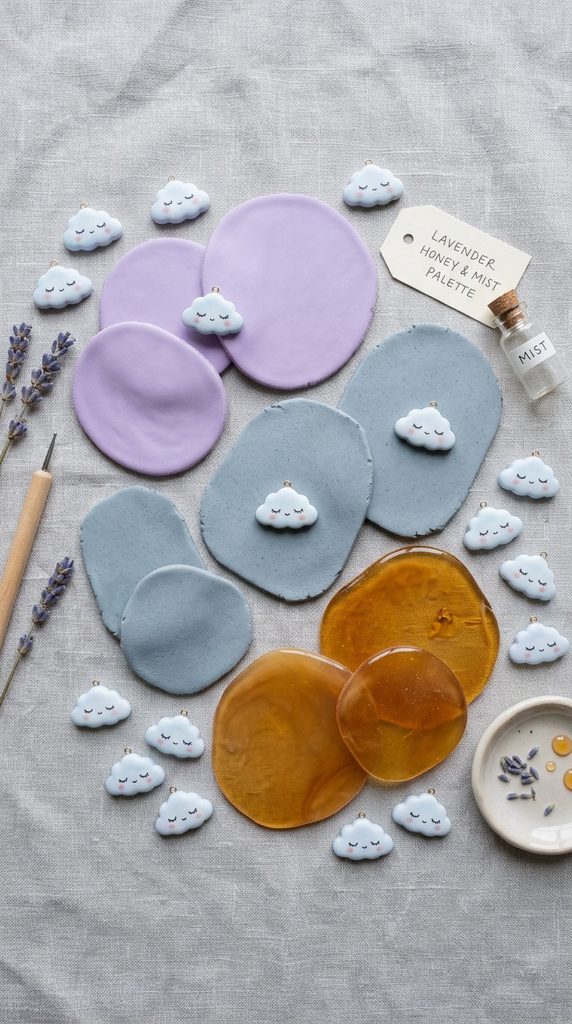
The lavender honey and early morning mist palette combines cool floral violet with muted heather gray and luminous pale honey amber. This design direction draws inspiration from quiet cottage gardens, balancing the calming influence of soft purple against the stabilizing warmth of translucent golden accents. The lavender shade delivers gentle romantic charm, while the cool gray acts as an atmospheric bridge that tempers the sweetness of surrounding tones. Incorporating a translucent honey element introduces optical depth, allowing ambient room light to penetrate the surface of your finished pieces rather than bouncing flatly off opaque pigments. This color configuration is particularly suited for crafting celestial accessories, tiny floral bouquets, fantasy creatures, and soothing desktop figurines that benefit from an ethereal, contemplative presence. The interplay between warm translucent amber and cool opaque violet produces visual interest without compromising the tender, welcoming sensibility fundamental to high-quality kawaii sculpture design.
Begin blending this palette by conditioning blocks of pure white, cobalt blue, alizarin crimson, raw sienna, and clean translucent polymer clay. To mix the delicate lavender tone, combine eighteen parts pure white clay with two parts translucent clay, one-half part alizarin crimson, and one-fourth part cobalt blue, adjusting gradually until achieving a dusty wisteria cast. Mix the morning mist gray by integrating twenty parts pure white clay with one-half part raw umber and a microscopic dot of carbon black, ensuring the resulting hue mimics natural stone rather than artificial industrial slate. For the translucent lavender honey accent, combine six parts clear translucent clay with two parts pure white clay and a single sliver of raw sienna to produce a warm, glass-like syrup effect upon curing. Roll each completed mixture through a conditioning machine five times to ensure complete molecular integration of the mineral pigments. Label each clay sheet with its recorded ratio on parchment paper backing to streamline exact color replication in future sculpting sessions.

3. Mint Macaron and Spiced Vanilla Palette
How to Create
The mint macaron and spiced vanilla palette merges refreshing botanical green with warm speckled cream and subtle seafoam highlights. This visual combination takes cues from Parisian pastry cases and vintage botanical kitchenware, providing a crisp, balanced profile that feels clean and invigorating. The primary mint hue relies on a balanced infusion of yellow-green and cool cyan, avoiding the harsh medicinal tones often seen in artificial turquoise clays. The accompanying spiced vanilla shade incorporates tiny organic flecks that replicate real vanilla bean pods, adding grounding tactile interest to the smooth clay forms. A secondary pale seafoam tone offers a subtle transition between the mint and cream, creating soft, natural gradient opportunities across multi-layered figures. This color grouping serves as an excellent foundation for miniature beverage charms, garden plant critters, and retro kitchen accessories where a fresh, balanced aesthetic is desired.
To prepare the mint macaron shade, start by thoroughly conditioning twenty parts pure white clay with two parts translucent clay to build a bright, elastic carrier base. Add one-half part phthalo green and one-fourth part primary yellow to the white base, folding the clay repeatedly through an acrylic roller until a creamy, pale spearmint hue emerges. Create the spiced vanilla clay by mixing fifteen parts white clay, three parts translucent clay, and a pinch of unbleached titanium, then incorporate a tiny dusting of finely ground cinnamon or cured dark brown clay shavings to yield micro-speckles throughout the slab. For the pale seafoam highlight, take four parts of the newly created mint macaron mixture and dilute it further with six parts pure white clay and two parts translucent clay. Smooth each finished color block into a neat geometric slab using an acrylic blade, trimming the outer edges cleanly to prevent premature drying along exposed corners before sculpting begins.

4. Peach Blossom and Butterscotch Cream Palette
Execution Process
The peach blossom and butterscotch cream palette presents a cheerful, sun-drenched aesthetic rooted in soft orchard tones and velvety dairy confections. This palette combines warm, fleshy peach with golden butterscotch cream and soft alabaster white, generating an inviting, wholesome ambiance across finished decorative pieces. The peach tone provides an approachable, cheerful warmth that simulates tender fruit skins or flushed cheeks on miniature animal faces. Butterscotch cream serves as an antique golden accent, grounding the lighter tones with a rich, comforting caramel undertone that enriches the overall composition. Alabaster white acts as a clean, framing element, lifting the surrounding warm tones and providing crisp visual margins for fine surface details. This palette is ideally suited for sculpting harvest-themed miniature animals, smiling fruit figurines, and warm kitchen magnets where an appetizing, cheerful presentation remains the primary design goal.
Formulate the peach blossom shade by preparing an elastic base of eighteen parts pure white clay and two parts translucent clay to support radiant light diffusion. Incorporate one part cadmium yellow and one-half part cadmium red into the white base, rolling the clay lengthwise and folding it across itself until a uniform, velvet-peach tone develops without marbling. For the butterscotch cream accent, combine twelve parts white clay, two parts translucent clay, one part raw sienna, and a touch of cadmium yellow to achieve a smooth golden-tan value. The alabaster white requires twenty parts pure white clay softened with two parts translucent clay, ensuring the material retains slight flexibility and light passage without altering the neutral white wavelength. Test the interaction of the three colors by rolling thin ropes of each shade, twisting them into a triple-strand braid, and checking color separation under indoor ambient illumination. Store the conditioned clay slabs between sheets of wax-free parchment paper to preserve surface moisture and prevent lint accumulation.

5. Cloudberry Fizz and Cotton Candy Palette
Setup Method
The cloudberry fizz and cotton candy palette captures vibrant carnival nostalgia by uniting airy cotton candy pink with bright cloudberry orange and soft cerulean blue. This playful tri-color scheme balances primary-adjacent warm and cool tones, delivering energetic visual appeal while remaining soft enough to preserve the signature kawaii pastel softness. The cotton candy pink acts as a sugary anchor, radiating friendly energy that immediately draws the eye across a busy display surface. Cloudberry orange introduces an unexpected citrus brightness, lifting the palette above standard baby pastels to deliver a contemporary boutique aesthetic. The whisper of cerulean blue provides cool, balancing contrast that frames the warm tones, preventing the composition from feeling overly sweet. This dynamic palette performs exceptionally well for carnival-themed miniature sets, fantasy mascot charms, and whimsical jewelry where expressive, upbeat storytelling is key.
Begin blending this dynamic scheme by washing all roller assemblies thoroughly to eliminate rogue pigment particles from previous mixing cycles. Create the cotton candy pink by combining twenty parts pure white clay with two parts translucent clay and a tiny bead of quinacridone magenta roughly two millimeters in diameter. Blend the cloudberry fizz orange by measuring sixteen parts pure white clay, two parts translucent clay, one part cadmium orange, and a touch of bright lemon yellow to preserve an airy citrus tone. For the cerulean whisper blue, incorporate twenty-two parts pure white clay with one part translucent clay and a minute speck of primary cyan, rolling until the mixture reaches a smooth sky-blue tint. Place small test balls of each mixed color side by side on an index card to confirm equal visual brightness across all three values. Keep these conditioned blocks covered with clean glass tumblers while working to shield the delicate, lint-attracting surfaces from airborne dust.

6. Matcha Cream and Toasted Sesame Palette
Blending Technique
The matcha cream and toasted sesame palette explores a sophisticated botanical balance inspired by traditional Japanese tea ceremonies and artisanal confectionery arts. This modern design blends muted tea-leaf green with creamy toasted sesame gray and warm steamed-milk ivory. The matcha green shade relies on olive and ochre undertones, steering clear of artificial neon brightness in favor of an organic, earthy softness that feels authentic and calming. Toasted sesame gray incorporates minute neutral speckles within a warm stone base, adding tangible depth that mimics natural earthenware ceramic glazes. Steamed-milk ivory supplies a gentle, neutral highlight that unites the botanical green and textured gray into a cohesive, balanced composition. This color system is perfectly suited for crafting miniature teahouse accessories, resting animal figures, and zen-inspired desktop charms that celebrate quiet, mindful craft aesthetics.
Produce the authentic matcha cream color by conditioning eighteen parts pure white clay, two parts translucent clay, one-half part olive green, and one-fourth part yellow ochre until the color distribution is perfectly smooth. To mix the toasted sesame gray, combine fourteen parts pure white clay with four parts translucent clay, one-half part raw umber, and a pinch of finely ground black pepper or cured black clay dust to create an organic, speckled appearance. The steamed-milk ivory base requires twenty-four parts pure white clay, one part translucent clay, and an extremely small speck of yellow ochre to remove cool blue undertones from the raw white pigment. Roll each formulated shade through your clay machine at a medium setting, inspecting the sheets against a neutral gray background card to confirm chromatic harmony. Stack the prepared sheets with protective paper interleaves, storing them flat within a dedicated plastic storage container to prevent structural deformation.

7. Powder Blue Sky and Sunbeam Yellow Palette
Step-by-Step Guide
The powder blue sky and sunbeam yellow palette evokes bright, sunny morning energy by pairing soft robin’s egg blue with radiant pale yellow and clean porcelain white. This classic visual pairing balances cool atmospheric serenity with warm, welcoming optimism, creating an open, expansive presence across miniature sculptural displays. The powder blue provides a tranquil, structured foundation that suggests open skies and gentle breezes, grounding the sculpture with a reliable, cool foundation. Sunbeam yellow acts as an accent of pure warmth, drawing attention to focal elements such as miniature hair accessories, stars, or decorative animal features without overpowering adjacent details. Porcelain white ties the primary accents together, offering crisp separation that ensures each distinct tone retains its visual integrity within tiny compositions. This cheerful scheme is particularly effective for sculpting baby animal keepsakes, miniature weather mascots, and nursery mobile figurines that demand a peaceful yet cheerful presentation.
To mix this sky-inspired palette, condition several foundational sheets of pure white, cobalt blue, cadmium yellow, and clean translucent clay until fully pliable. Formulate the powder blue sky tone by combining twenty-two parts pure white clay with two parts translucent clay, one-half part cobalt blue, and a microscopic dot of phthalo green to produce a soft cyan-shifted finish. For the sunbeam yellow accent, blend eighteen parts pure white clay with two parts translucent clay and one-half part cadmium yellow, making sure the mixture avoids greenish or reddish color shifts. The porcelain white shade consists of twenty parts pure white clay combined with four parts translucent clay, creating a milky, semi-opaque look that cures without the chalkiness of pure raw white clay. Roll each completed mixture into smooth, rectangular blocks measuring five millimeters in thickness using an acrylic guide rail system. Keep your work area free of stray blue and yellow clay scraps by cleaning your working tools between each color transition.

8. Lilac Breeze and Pistachio Gelato Palette
Formulation Method
The lilac breeze and pistachio gelato palette pairs floral violet tones with nutty green accents, delivering an imaginative and sophisticated dessert-inspired color scheme. This pairing plays on complementary color theory, setting soft cool lavender against crisp, yellow-leaning pistachio green to produce gentle visual interest. Because both hues are lightened significantly with white and translucent mediums, the contrast remains soft, charming, and distinctly kawaii rather than visually jarring or aggressive. A soft whipped-cream white functions as the mediating neutral, softening transitions and offering clean separation between the floral and botanical tones. This modern color pairing works wonderfully for crafting boutique jewelry pieces, fantasy miniature charms, and decorative dessert plates where an upscale, contemporary craft aesthetic is desired. The balance of warm green and cool violet brings dynamic depth to rounded clay surfaces, capturing delicate highlights and gentle shadows across intricate sculpted details.
Begin blending the lilac breeze shade by conditioning sixteen parts pure white clay with two parts translucent clay, one-half part ultramarine blue, and one-half part quinacridone violet until a smooth, cool petal-purple tone is reached. For the pistachio gelato shade, combine eighteen parts pure white clay with two parts translucent clay, one-fourth part sap green, and one-half part lemon yellow, working the slab until a soft, creamy nut-green hue develops. Create the whipped-cream white component by blending twenty parts pure white clay with three parts translucent clay, ensuring a silky, elastic consistency that extrudes easily through precision clay syringes for decorative borders. Lay out samples of both tinted clays alongside the white base on a white ceramic tile to confirm they share matching saturation levels and value depth. Store the completed batches in clearly labeled zip-top craft bags, keeping them away from direct sunlight and heat sources to preserve their handling consistency.
9. Cherry Soda and Bubblegum Sherbet Palette
How to Create
The cherry soda and bubblegum sherbet palette brings playful retro energy to modern craft boards by blending vintage confectionery colors with a bubbly aesthetic. This high-energy kawaii scheme unites soft cherry crimson with vibrant bubblegum pink and a refreshing splash of pale mint foam. The soft cherry tone supplies visual depth and structural weight, functioning as an anchor for small details like miniature fruit stems, hair bows, and footwear on sculpted characters. Bubblegum sherbet pink provides a cheerful mid-tone that radiates nostalgic sweetness, acting as the primary volume color for charming bodies and dessert toppings. Pale mint foam delivers unexpected, refreshing contrast, breaking up the warm pinks and reds to keep the overall design feeling dynamic and modern. This palette is well suited for vintage soda-shop figurines, retro character charms, and playful accessories that aim to capture an expressive, energetic pop aesthetic.
To blend the soft cherry crimson tone, thoroughly mix twelve parts pure white clay, two parts translucent clay, two parts cadmium red, and a minute speck of burnt umber to create a muted vintage cherry hue. For the bubblegum sherbet pink, blend twenty parts pure white clay with two parts translucent clay and one part fluorescent pink or magenta clay, folding until the bright tone softens into a creamy, luminous pastel pink. The pale mint foam requires twenty-four parts pure white clay, two parts translucent clay, and one-half part light emerald green, producing a frosty, delicate accent shade. Roll each blended color through your clay conditioning machine at the thickest setting, folding the edges inward to form tidy, rectangular work slabs. Inspect the three hues under bright, daylight-balanced artificial lighting to ensure the tones feel unified and properly balanced before starting detailed character sculpting.

10. Apricot Glaze and Muted Seafoam Palette
Execution Process
The apricot glaze and muted seafoam palette offers an elegant, nature-inspired aesthetic that bridges soft ocean tones with warm coastal orchard hues. This thoughtful palette pairs juicy pastel apricot with a dusty, mineral-rich seafoam green, accented by an understated sand-drift beige neutral. The apricot glaze brings gentle, sunny warmth that feels inviting and wholesome, making it an excellent choice for sculpting smiling animal cheeks, miniature bakery crusts, and warm decorative accents. Muted seafoam introduces a balancing coolness, using mineral green undertones that evoke weathered beach glass and coastal flora. Sand-drift beige serves as a grounding organic neutral, softening the transitions between the warm apricot and cool seafoam tones. This refined palette works beautifully for woodland animal charms, beachcomber miniature sets, and understated home decor accents that call for a mature, artisanal interpretation of the kawaii aesthetic.
Begin preparing this coastal palette by conditioning foundational blocks of pure white, cadmium yellow, cadmium red, raw umber, and emerald green clay. Mix the apricot glaze shade by combining sixteen parts pure white clay with two parts translucent clay, one part cadmium yellow, and one-fourth part cadmium red, blending until a warm, luminous fruit tone is achieved. To create the muted seafoam shade, integrate twenty parts pure white clay with two parts translucent clay, one-half part emerald green, and one-eighth part raw umber to soften the green into a dusty, natural hue. For the sand-drift beige neutral, combine eighteen parts pure white clay, two parts translucent clay, one-half part raw sienna, and a speck of raw umber. Roll each completed clay batch into a smooth, even sheet, trimming the edges square with a stainless steel tissue blade. Keep the conditioned sheets stored between sheets of acid-free glassine paper to keep the clay clean, supple, and ready for precision sculpting.

Preventing Common Beginner Clay-Mixing Mistakes
A frequent problem when creating pastel polymer clay palettes is introducing too much saturated base pigment too quickly, which overpowers the delicate white foundation and ruins the intended pastel value. Because primary mineral pigments are concentrated, even a tiny pinhead of blue or red can tint a large ball of white clay much darker than planned. To avoid this, always add saturated colors to your white base in tiny, incremental shavings, testing the color on a rolled sheet before adding more pigment. Another common pitfall is failing to account for thermal color deepening, as many polymer clay formulations darken by one to two full shades when cured in the oven. To prevent unexpected color shifts on finished sculptures, always bake small, labeled test chips alongside an oven thermometer to verify the final post-cure color before working on large projects. Additionally, working on porous surfaces like unfinished wood or dusty cardboard can transfer loose fibers directly into pale clay, permanently clouding delicate pastel hues. Finally, skipping translucent clay in your pastel recipes can result in chalky, lifeless, opaque tones that lack the depth and warmth characteristic of professional kawaii artistry.
Practical Methods for Professional Color Consistency
Achieving clean, repeatable color results across multiple crafting sessions requires disciplined measuring habits, careful record-keeping, and reliable conditioning techniques. Use calibrated metal clay cutters—such as small circles or uniform squares stamped from a consistent sheet thickness—to establish reliable volumetric measuring units rather than guessing clay proportions by eye. Keep a dedicated workshop notebook detailing every custom color formula, recording the exact base clay types, roller thickness settings, and part-to-part ratios used for every successful batch. To eliminate persistent streaks and produce perfectly smooth colors, fold your clay sheets in the same direction through the pasta roller, which aligns the plasticizers without trapping unwanted air pockets between layers. When rolling light pastel colors, keep a sacrificial ball of scrap white clay on hand to run through your rollers before processing your work slabs, picking up any stray dark lint or metallic residue left in the machinery. Finally, store mixed pastel batches in airtight, non-reactive polypropylene containers away from direct heat to prevent premature curing, plasticizer leakage, or lint contamination during extended creative projects.
Styling, Presentation, and Storage Solutions
Presenting and organizing your pastel polymer clay creations thoughtfully enhances their visual appeal while protecting delicate surfaces from damage over time. When photographing finished kawaii charms and figurines for visual portfolio boards, use neutral, matte backgrounds like light birch wood blocks, travertine tiles, or linen fabric under soft, indirect morning light to capture true pastel colors without harsh glare or distracting reflections. For practical desk organization, arrange finished miniature charms in clear acrylic display cases, compartmentalized drawer systems, or velvet-lined shadow boxes to shield the pale, unvarnished clay from airborne household dust. You can also organize your working raw clay slabs by color family inside flat, lidded organizer cases, using wax paper dividers between sheets to keep distinct colors from transferring pigments during storage. If packaging handmade pastel pieces for gifting, wrap each item in acid-free tissue paper and secure it inside sturdy rigid boxes rather than soft envelopes, ensuring delicate elements arrive in pristine condition.
Budget Considerations and Production Scheduling
Managing materials, studio time, and supply costs efficiently allows makers to produce consistent, high-quality clay projects without excessive spending. Rather than buying dozens of specialty pre-mixed pastel blocks, invest in large, cost-effective blocks of pure white, clean translucent, and core primary pigments, which serve as the foundation for hundreds of custom pastel variations. A standard color-blending and sculpting session takes about three to five hours, divided into organized phases: cleaning and tools setup, batch measurement and mixing, test-chip baking, and final sculpting. Maximize your crafting time by mixing large master batches of your most-used pastel base colors in a single dedicated prep session, storing them in labeled containers so they are ready for spontaneous crafting. Purchasing essential hand tools—like acrylic rolling rods, high-grade tissue blades, and ceramic baking tiles—from domestic hardware and culinary suppliers often saves money compared to specialized boutique craft brands. This systematic approach to supplies and studio scheduling keeps your craft work affordable, well organized, and consistently productive over long-term creative projects.
Creative Expansions and Advanced Palette Techniques
Once you feel confident mixing foundational pastel palettes, you can explore advanced decorative techniques that add further visual depth to your kawaii polymer clay sculptures. Try creating delicate skinner blends, smoothly transitioning between two harmonious pastel sheets—like baby pink and soft butter yellow—to generate luminous gradient slabs ideal for miniature flower petals or fairy wings. Another creative path involves cane-making, where you assemble geometric or character motifs into a master block and slice off thin, repeatable veneers to decorate miniature accessories. You can also experiment with surface chalk pastels, gently brushing finely shaved cosmetic or artist pigments onto raw clay curves before baking to create soft, blushing gradients and rosy character cheeks. For added surface variety, try applying a micro-layer of clear liquid polymer clay over baked pieces to create a high-gloss syrup or fruit-glaze effect that contrasts beautifully against smooth matte clay surfaces. These advanced techniques help you build a distinctive, recognizable artistic voice, turning simple pastel clays into refined, collectible miniature art.